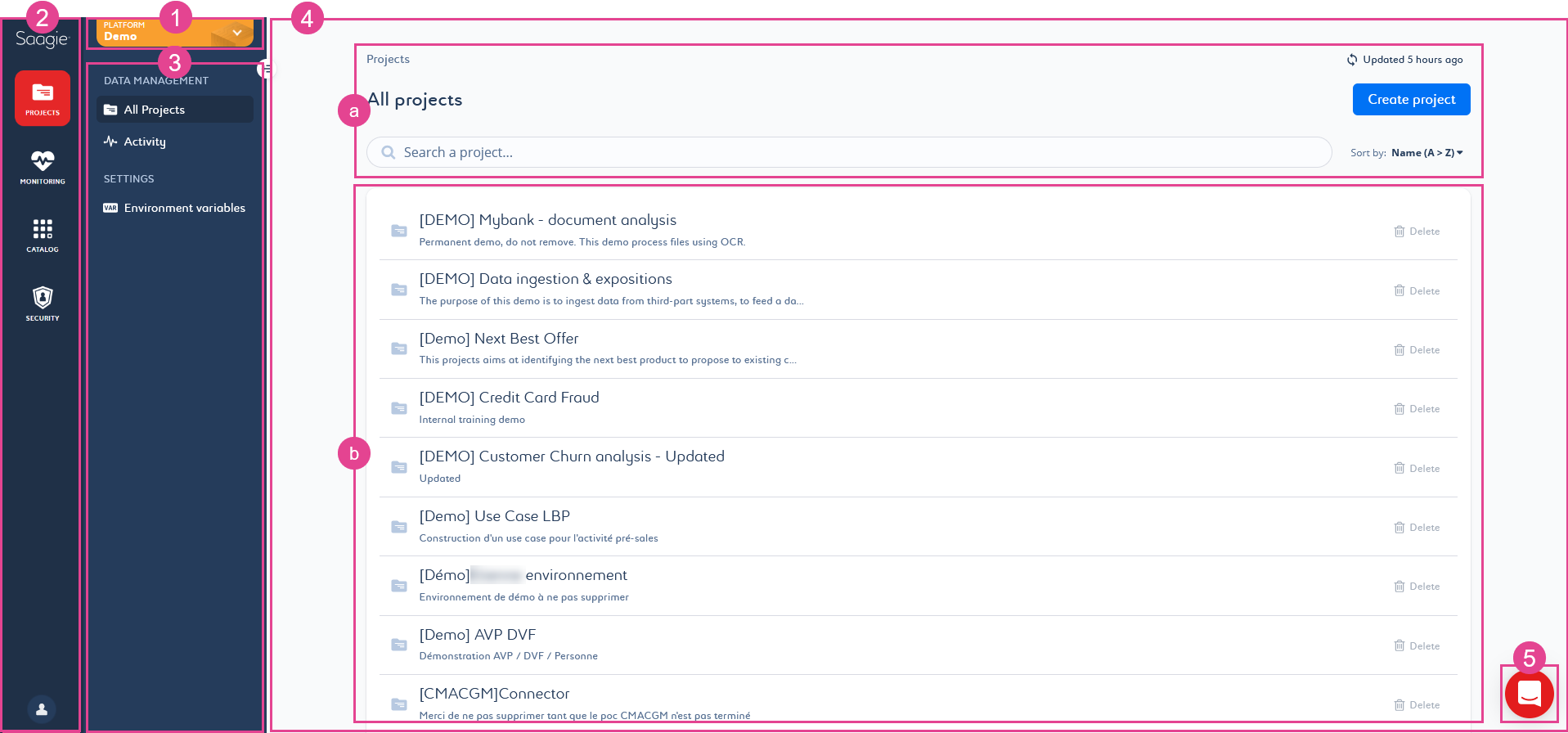
Getting Familiar With the User Interface

1. Platform Menu
| Icon | Title | Description |
|---|---|---|
|
Platform |
Gives access to your organization’s platforms based on your access rights. |
2. Primary Navigation Menu
The primary navigation menu includes the main modules specific to Saagie.
| Icon | Title | Description | ||
|---|---|---|---|---|
Projects |
Allows you to manage your projects within a platform. A project brings together users and their jobs, pipelines, and apps to meet a specific use case.
|
|||
Monitoring |
Allows you to monitor your infrastructure at the cluster level, proactively maintaining consistently high level of data quality.
|
|||
Catalog |
Allows you to manage technology repositories and create custom ones. Repositories contain the app technologies, and job technologies used in your projects. It is a cross-platform module, which means that the repositories related to it are shared between platforms.
|
|||
Security |
Allows you to manage user accounts, user groups, and their associated rights on your platforms. It is a cross-platform module, which means that the user accounts and groups related to it are shared between platforms.
|
|||
Datalake |
Allows you to connect the management interface used to explore your data lakes (Hue for Hadoop data lakes). Clicking Datalake opens a context menu with the list of available data lakes.
|
|||
User Account |
Allows you to view and edit your profile details, view the product info, such as its version and the build IDs of individual modules composing the Saagie software, and log out. |
3. Secondary Navigation Menu
The available pages that appear in the secondary navigation menu are contextual and linked to the selected module. For more information, see the Data Team Guide.
|
Click the button |
4. Page Content
The page content is contextual and linked to the selected page in the secondary navigation menu. It can be divided into two parts: the header and the body of the page.
-
The header
Even though some changes may occur, the following elements mostly make up the header of the pages:
-
The breadcrumb trail (1), which allows you to keep track of your location within Saagie.
-
The title of the page (2), which appears on all pages.
-
The update button (3), which indicates you when the page was last updated. You can also click it to update the page instantly.
-
The settings menu (4), which allows you to manage the settings of the mentioned item.
-
The Create button (5), which is contextual and allows you to create new items, such as jobs, pipelines, apps, repositories, and so on. It may differ slightly on some pages.
-
The search bar (6), which allows you to perform a quick search on the displayed list.
-
The Sort by filter (7), which allows you to sort the items in the list in ascending or descending order, by creation date, by name, and so on.
-
-
The body
The content of the page body is contextual and linked to the page selected in the secondary navigation menu. For more information, see the Data Team Guide.
5. Saagie Helper
| Icon | Title | Description |
|---|---|---|
|
Saagie Helper |
Gives you access to Saagie customer support, to our online documentation and to our contextualized GraphiQL Explorer. |